Showing posts with label Embossing Folders. Show all posts

Wednesday, April 13, 2022

Playing With Inks


 It has been awhile since I have posted.  Life happens!  And I am preparing for my final challenge in the AECP.  Wish me luck.  It has been a wonderful journey thus far and I do feel my techniques have improved.

This card came about as I was watching videos on layering stencils.  I don't have many of those in my stash but I did see this Decorative Florals 3D Embossing Folder in my stash.  After embossing it onto white cardstock, I played with my inks by adding them to the embossed image.  I really like the results and did not use any stencils.  I was just careful when adding my ink. The sentiment is from the Tall Foliage set. I did add a few line details with a gold pen.

I hope this short post inspires you to play a little.

Happy Stamping!

Wednesday, February 16, 2022

AECP-Transcending Tattoo Techniques

 Hello! I hope you are having a great day.  I recently completed another Altenew class and really found this one fascinating.  The instructor, Jaycee Gaspar, researched different tattoo techniques and transferred them into card making techniques.  Not only did I pick up a few card making techniques, I learned a little about tattooing. I will note the tattoo technique that inspired each card as we move along.


The above card was inspired by the tattoo technique called Trash Polka.  I was so intrigued by this that I actually googled several tattoo images-give it a try yourself. I found some truly beautiful artwork. All images were stamped onto a sand colored cardstock from my stash and then adhered to a white A2 card.  The background was partially stenciled using black ink and the Woven Stencil. The circles were stamped in red and the image is from a bicycle stamp in my stash.  I also added black splatters.  The blooms are from the Wallpaper Art set (one of my favorites) and the leaves are from the Darling Rose set.  The sentiment is from the Halftone Happy set. 


Here is a close up of the flower.  I did rough up the edges of my background and lightly ink blend the edges in black to add to the organic feel of the card.


This card utilizes the Loose Watercolor Technique.  After stamping and heat embossing the butterflies from the Painted Butterflies set in black onto watercolor paper, I wet specific areas and scraped dry pigment from the 12 color pan watercolor set onto the wet areas.  I did move some of the pigment around with a wet brush.  I used the same method on another piece of watercolor paper, then stamped and heat embossed the word happy and the sentiment from the Halftone Happy set. The background is dry embossed using the 3D Cloudy Day Embossing Folder.  The clouds were enhanced by adding highlights with white craft ink.


I hope you can see the pigment in the enlargement.  Can you see the variation of pigment? 


This card refers to the tattoo technique called Old School/Graphic Coloring.  To do this, first stamp the outline and then stamp the most detailed layer.  Hand color using your preferred method and use to create your card. I added some splatters and black gems to complete my card.  


The blooms and leaves are from the Always There set and the sentiment is from the Japanese Mum set.  The small white and black images are the tips from the Starry Flowers set.


This card was inspired by the Dotwork/Pen Shading Details technique.  I was slightly intimidated at first, but found it relaxing as I went along. Below is the stamped image prior to any dot work.


I used the Dotted Scales Debossing Cover Die, the Fancy For You Die, and the Just Leaves Dies to complete my card.  The bloom is from the Build a Flower-Gardenia set.


I hope you enjoyed this post and will give this class a try.  

Happy Stamping!

Friday, February 4, 2022

AECP-Layering 3D Dies & More

 Another class from Altenew has done it again!  This class focused on using dies and not stamps.  My plan was to make cards with minimal or no stamping-just using dies.  Let's get started.


I started this card by cutting the Floral In-N-Out Border die from masking paper and adhering it to my card front.  I then used Altenew Alcohol Markers R301, R206, R403 and G702 to color through the openings in the die.  I then removed the masking paper and touched up a few areas.  After using the same die to cut another out of black cardstock, I adhered it to my card front.  The strip along the left side and the sentiment are cut from Dazzling Diamond cardstock.  The sentiment is from the dies for the Majestic Bloom set.  A few crystal gems are added for a tiny bit of bling. I also rounded my top and bottom edges on the right side.


With Valentines Day close, we all could use "love" cards.  I will have to admit, this card got a little messy!  After cutting the hearts and the You Are Loved from heavy white cardstock, I covered them with VersaMark ink.  I then added Red, Black and Silver embossing powders in random order and heat set.  I then added 2 more layers of cardstock to my sentiment.  I had a cover plate in my stash to make the pierced heart background.  After adhering my pieces to the pierced background, I attached it to a red A2cardfront.


This card can be completed in about 10 minutes and is one of my favorites!  I looked through my scrap stash (we all have them) and found some bright, coordinating colors.  I then used the Waterbrush Hello die on each piece.  I adhered them to my cardfront  and then used the Mod Squares 3D Embossing Folder for dimension.  After this was done, I ran the Antique Gold Pigment Ink Pad over the card lightly.  This card is one that can be used for a wide variety of ages. 

This post was short but these cards were a joy to create.  Until next time-

Happy Stamping!

Tuesday, October 26, 2021

AECP-Level 2-In The Mood for Color

 These cards are inspired my my latest Altenew class- In The Mood for Color.  Did you know that your color choices relay a message to the recipient?  I had never considered this when card making.  This class was another good one in the Altenew lineup.  

My first card uses blue as the main color.  Blue is calming and tranquil. I think this is a good color for a sympathy card and this one is going to my cousin in North Carolina who recently lost his wife.


I stamped each of the blooms in the Wallpaper Art set and colored them with various blue Copic markers.  After stamping the leaf stamp from that set onto my cardstock using Hunter Green ink, I ink blended Arctic blue ink around the edges. I then arranged my blooms.  I attached my cardstock piece to a black piece of cardstock slightly larger.  My sentiment is stamped in black and is from the Starry Flowers stamp set.  This piece was also backed with black cardstock.  All were then adhered to an A2 card base.  The blooms were trimmed as they were hanging over the edge in places.

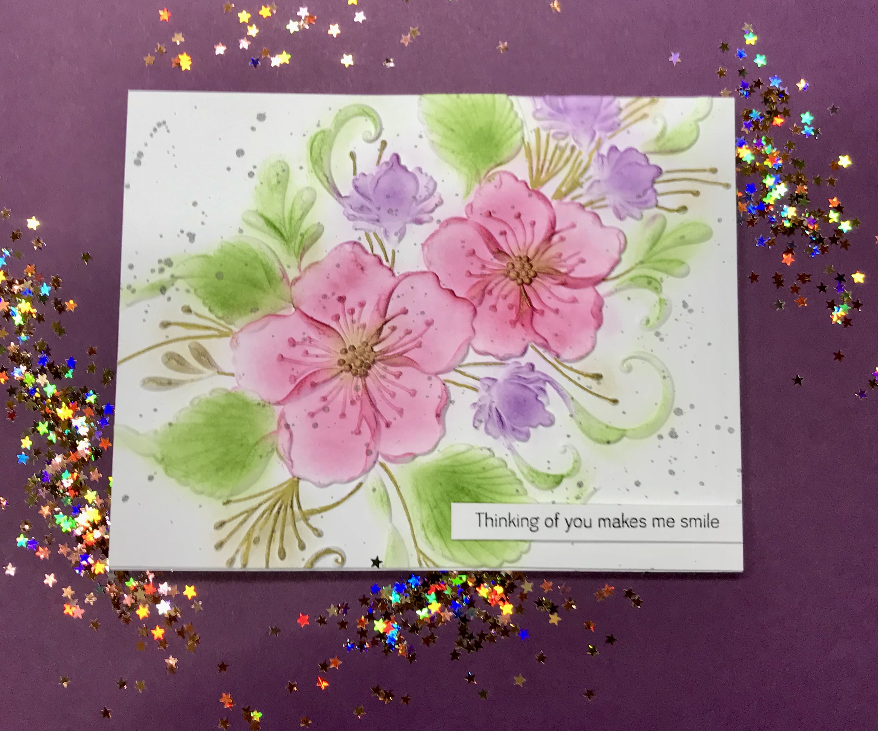
The color red signifies love, passion or energy.  The Watercolor Blooms stamp set if full of blooms and is easy to stamp.  I stamped several of the images using a base layer of pink with the second layer in red.  The foliage is stamped using Just Green ink.  The sentiment is from the Paint A Flower Anemone set and stamped in red.  


The circle of black and white is preprinted vellum from my stash backed with a white piece of cardstock.  I dry embossed my card front with an embossing folder in my stash as well.  I thought the tiny dots continued the theme of my card.  After die cutting and attaching all of my pieces, I adhered my card front to an A2 card base.


Yellow is a color that can demonstrate energy, optimism, or cheer.  I think this card does that.  It utilizes a partial die cut technique that I have been wanting to try.  The bloom in the Ranunculus set is perfect for this. I used Mocha, Citrus Burst, Maple Yellow, Honey Drizzle and Caramel Toffee for the flower.  The foliage was stamped using Galactic Stream, Dew Drops and Aqualicious inks. I then ink blended the edges using Maple Yellow.  The sentiment is stamped in Galactic Stream, then in Versa Mark and then heat embossed with clear embossing powder. To finish off the card, I added tiny gold splatters.


The next two cards are quick and easy ones using embossing folders.  Altenew has some amazing folders.  I received this one in my last order and love it!  This is the Floating Foliage embossing folder.  I used a very light green cardstock from my stash.  After the panel was embossed, I lightly ran Cracked Pistachio Distress Oxide Ink over the raised portions.  I used Lucky Clover Distress Oxide ink to darken the centers of the leaves. I cut a 1 1/2" strip off one end of my panel and after white heat embossing my sentiment, I attached it to black cardstock.  I then attached the top portion, added a few pearls and attached to an A2 card base.


Words associated with the color green are growth, soothing and natural.  This embossing folder seems to use those words as well.  The card below uses the same technique as above with a slight color change.  I used Mowed Lawn and Luck Clover Distress Oxide inks.  I completed the card using the Fancy For You die cut out of some gold card stock in my stash. I did add a few matching gems from my stash as well.


Two slightly different looks using the same embossing folder.  I hope you enjoyed today's cards.

Happy Stamping!

Altenew April Inspiration Challenge

It has been a long winter here! I woke up to snow on the ground again! Next winter may be a time for travel to a warmer climate! This m...